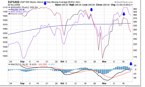
This will take a bit of study but that is what college is all about, eh? The red and black line tracks the number of stocks trading above their 50 day moving average. The three blue arrows show a pattern of lower highs. This mean fewer and fewer stocks are trading up, more are trading down. The purple line is the actual SPX or St and Poors 500 average. So the overall average has gone to a new high with fewer and fewer stocks higher. A divergence occurs when one indicator does not confirm another. This rally has thinner and thinner participation. Only the price of a handful of large stocks are still going up. Since the S & P is weighted to reflect the larger stocks, this can happen.
At bottom the Moving Average Convergence Divergence MACD indicator is rolling over. The party from March 9 is about to end.
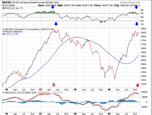
The advance decline line is a computation of the number of stocks up for the time period minus the numb er down. The stock market is advancing when advances outnumber declines. Note this is a WEEKLY chart. The market actually started down in the summer of 2007. It bottomed in March of 2009. The market has apparently finished a move up. The A/D Line is starting to top as shown by the blue arrow, similar to 2007. The red arrows at bottom show MACD rolling over. Since this is a weekly chart the signals are usually more reliable and slower to register than on a daily chart.
bottom line, Bernake has gotten all he will get out of flooding the market with money. As in 2007 it may last a while longer before a real meltdown occurs but the markets are on borrowed time now.

Leave a comment