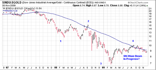
This is a ratio chart. It is a ratio of the Dow Industrial Average versus the price of gold. When the ratio direction is down, gold is net outperforming the Dow, which is the point of a ratio chart. It seems to me this displays a pretty clear elliott wave pattern. Wave two was sideways, wave four exhibits alternation by jumping sharply. Notably Wave 4 encountered resistance at the usual 50 week MA that turned the ratio back in fall of 2008. It would appear that a fifth and final wave to new Dow lows and new gold highs or of course come permutation lies ahead.
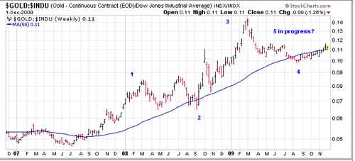
If readers prefer up to down, here is the same picture inverted. the chart looks like it is trying to go up to me. The Dow Average is being re priced in gold.

Leave a comment