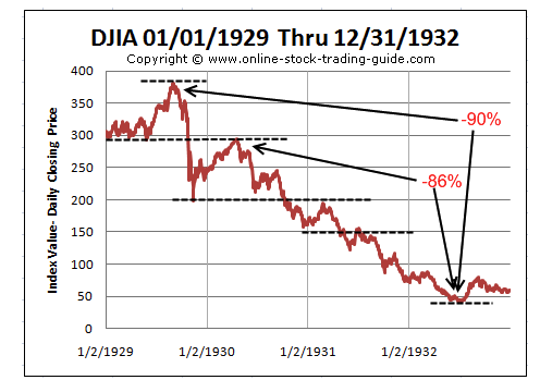
We regret that stockcharts.com does not have data for the 1930s. Here is however a linear graph of what happened. THe market topped in 1929 and crashed that fall.
High 390
Low 196
Recovery 294
At the recovery high everyone then, Hoover among them assumed things were back to normal. We are experiencing the same deja vu now, politicians are declaring their heroic efforts have saved the day.
But as the chart shows, the market rolled over and then really crashed over two years losing 86% of its post crash high! So where are we now?
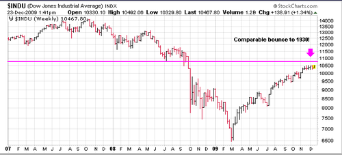
One has to go back to October 2007 to pinpoint the pre crash high. THe market wandered for a longer period but finally settled down and crashed from 11,000 in the fall of 2008. It recovered this year and appears it will still be doing so into the spring, So the time horizon has been lengthened this time. The purple arrow and line duplicate the line at 300 shown on the top graph.
Note at top it took two years from that spring to find a bottom at 41! 1972-74 offers another parallel.
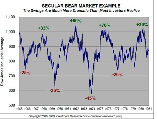
The stagnation of the 1970s presents the same picture, huge rallies followed by huge declines.
We expect this will continue the next few years. The unemployment, the negative equity in real estate, the weak bank sector all speak to problems to be addressed.

Leave a comment