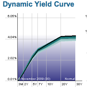
 The yield curve shows the difference in short and long term rates on one graph. The steeper the curve the greater the difference in short and long rates. Right now, long rates seem to be anticipating higher interest rates. Reports are that the difference in short and long rates has not been higher than it is now for many years.
An interesting graph is here. It allows one to see the yield curve at any point versus the S & P over the last few years.
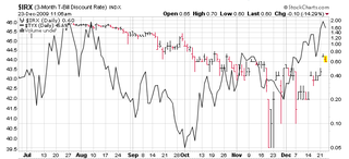 We were surprised at the rise in very short term rates when we put this next graph together. It compares the 3 moth T bill rate in black and red with the very long 30 year bond rate.
Point is, they are both going up. Bond holders and buyers are beginning to demand a higher interest rate to hold bonds issued by this government.

Leave a comment